Context & Starting Point
As part of my freelance work with gen.video, I worked on the UX and visual design of their new campaign creation tool. For some context, they connect brands and social media influencers for product promotion content. This new tool was created in an effort to automate a very manual process. The idea was to allow brands to create their own campaign offers for creators to apply to without the intervention of gen.video staff.
I came into this project after it was in progress. I was provided with the below wireframes (used as specifications for content and functionality) and screenshots of the current system.
The starting point of the campaign creation tool.
The starting point of the campaign creation tool.
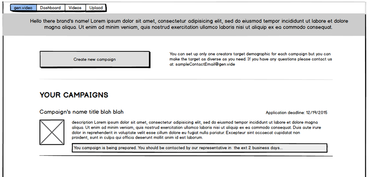
Client-Provided Wireframe: Depicts the "Campaign Dashboard" where created campaigns could be viewed and managed.
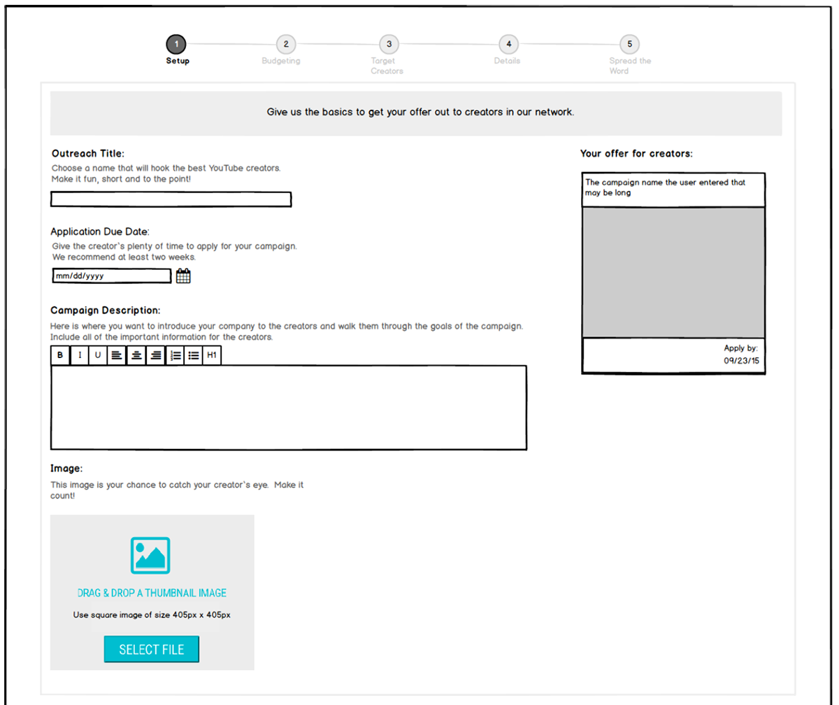
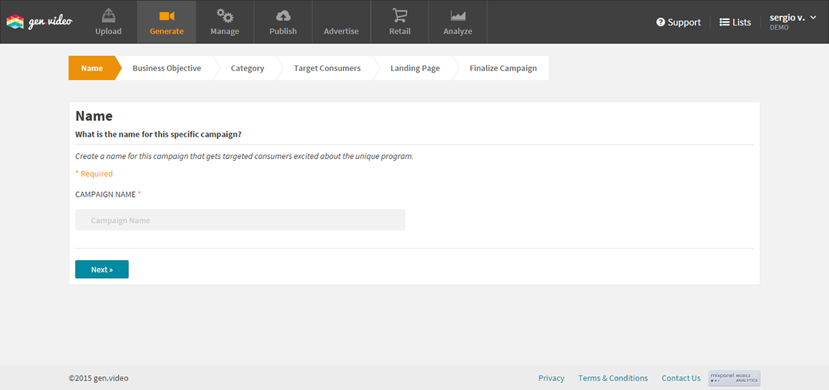
Client-Provided Wireframe: Step 1 of Campaign Creation.

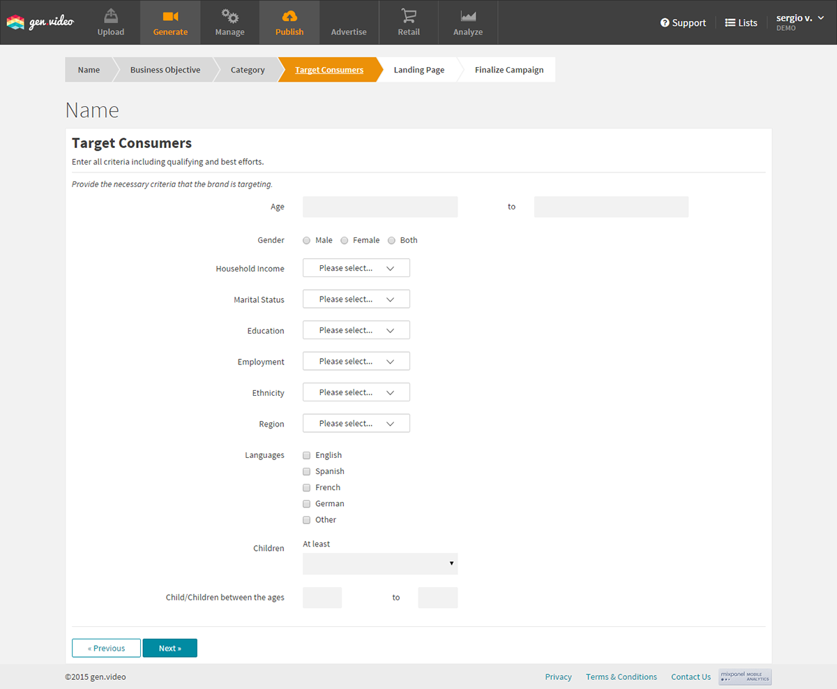
Client-Provided Wireframe: Step 2 of Campaign Creation.
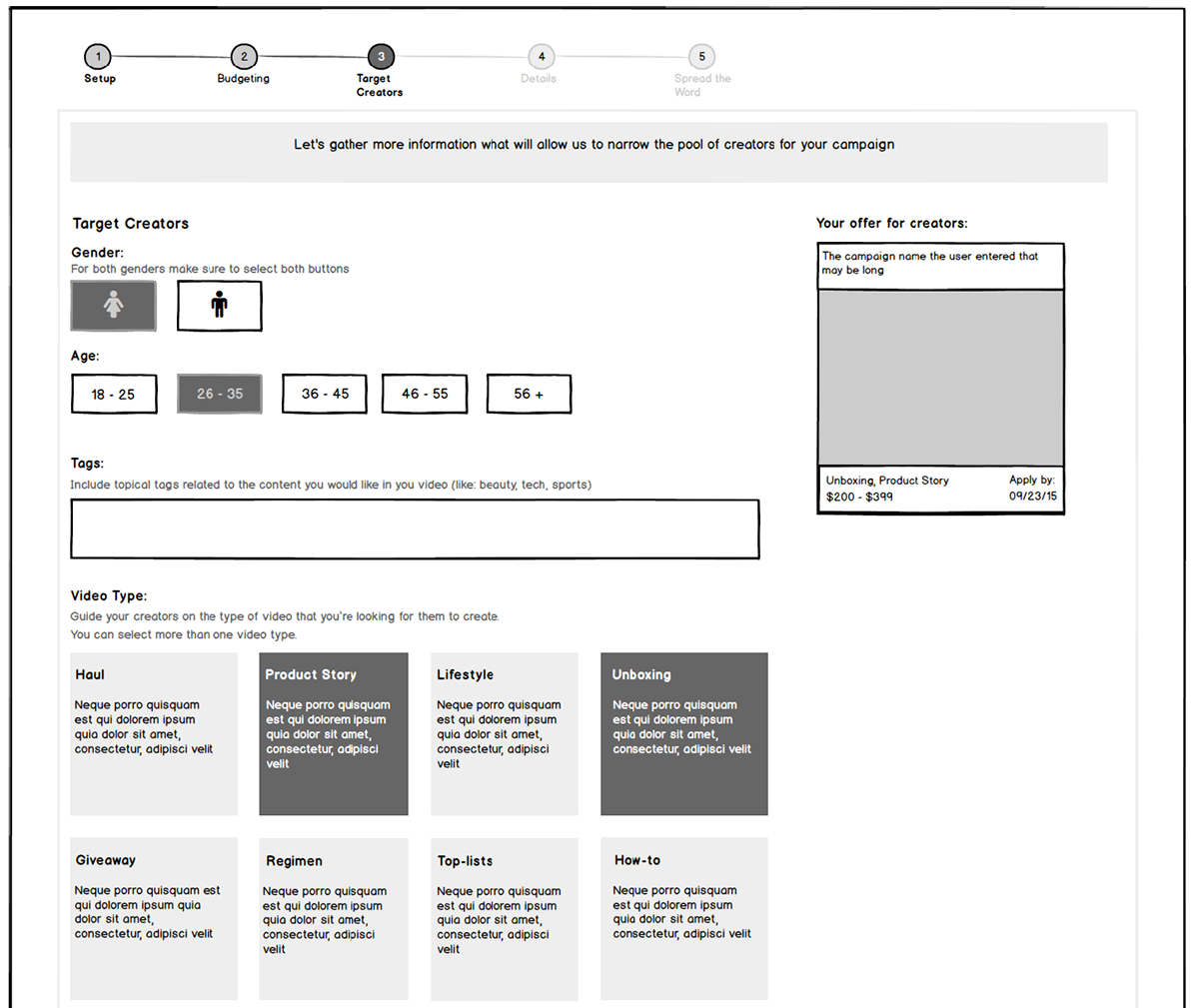
Client-Provided Wireframe: Step 3 of Campaign Creation.

Client-Provided Wireframe: Step 4 of Campaign Creation.

Client-Provided Wireframe: Step 5 of Campaign Creation.
From here, I provided some UX feedback on the provided wireframes. For instance, in Step 2, the layout did not lend itself well to comprehension - reading as a set of three substeps rather than a single set of fields with accompanying relevant information. Another case was Step 5 which had a sense of redundancy/inefficiency. Along with these recommendations, I provided intial visual designs based on their provided style guide which specified fonts and colors.
Version 1
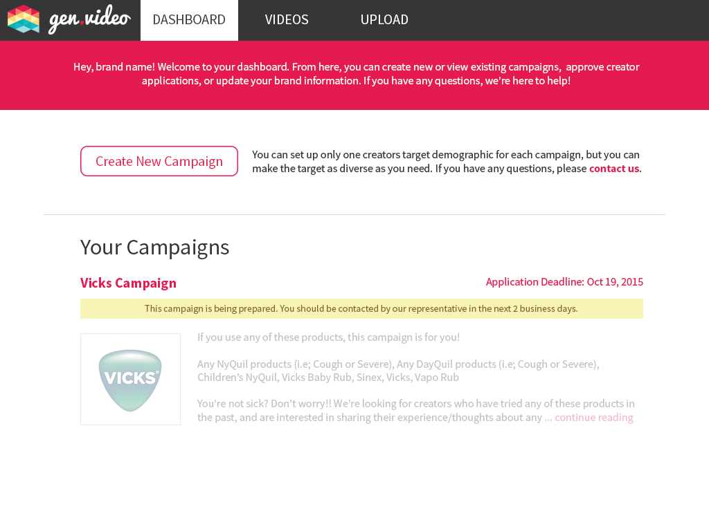
Campaign Dashboard where brands could see and interact with their content.
Step 1. Improvements included alignment and copy updates.
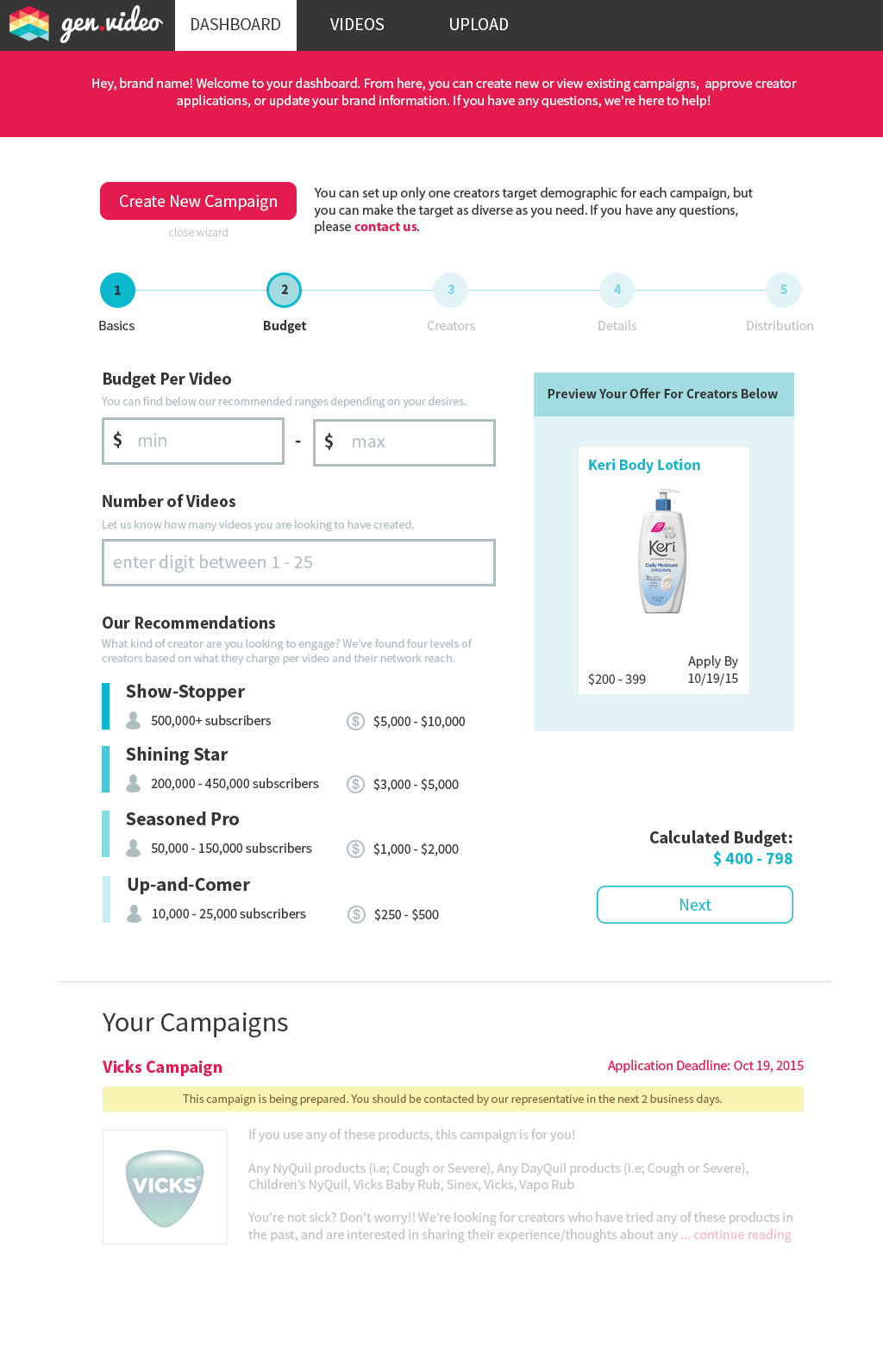
Step 2. Improvements included layout (the preview stays put and the supporting information about creator type is more closely linked to the budget fields) as well as alignment and familiarity (i.e. the layout of the budget range fields).

Step 3. Improvements to layout/alignment.
Step 4. Improvements to alignment.
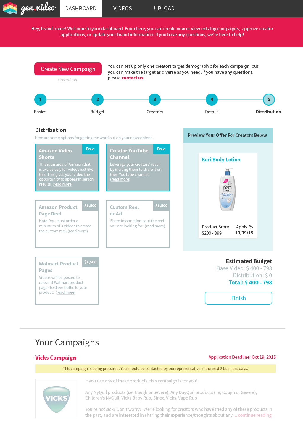
Step 5. Improvements included a tighter, more logical, and more scalable grouping of distribution options and a layout more conducive to forward motion (moved the budget to just above the "finish" button as a sort of "confirmation" step).
Version 2
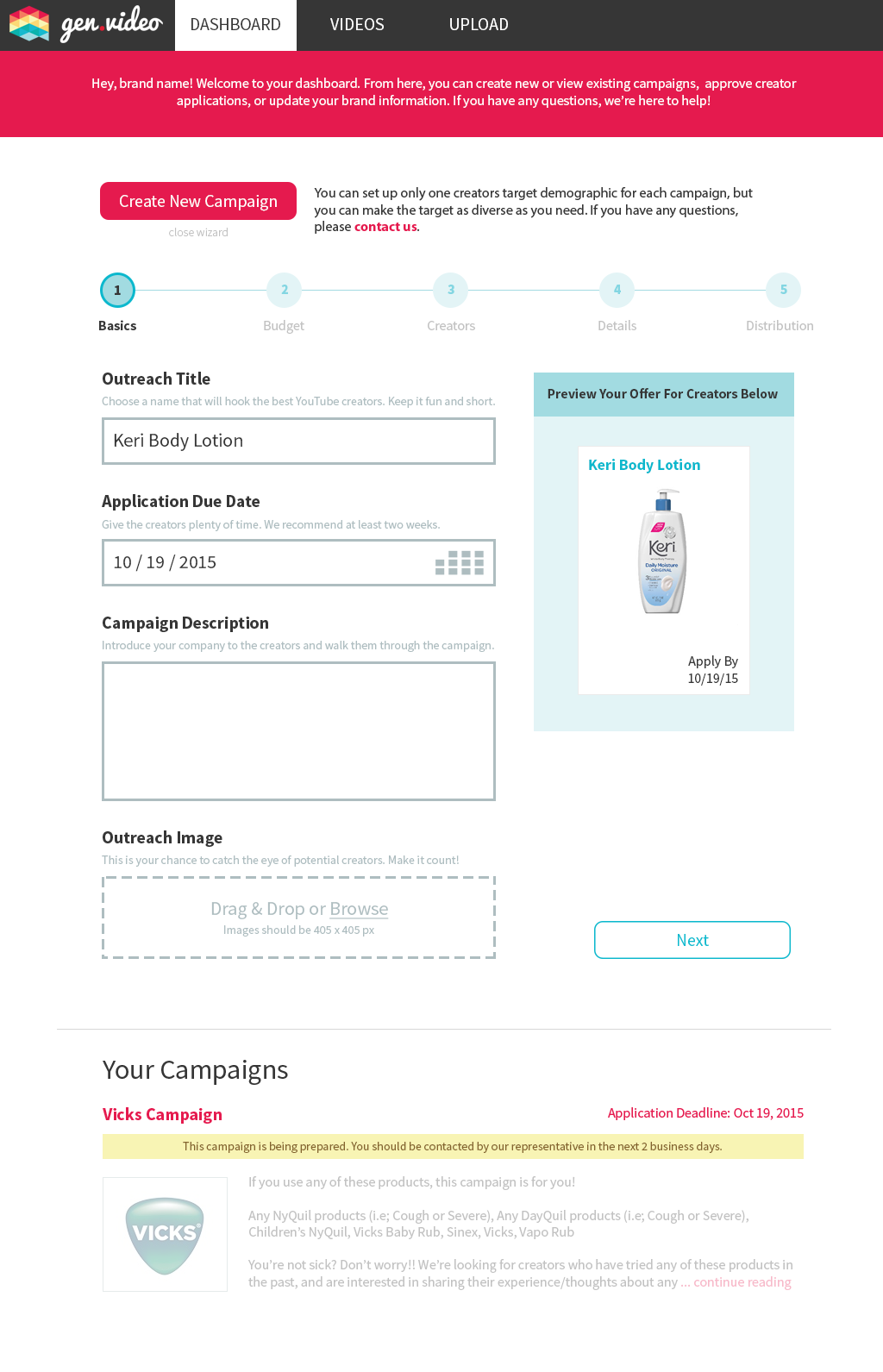
After submitting version one, I met with the product manager, UX engineer, and COO to review the designs. The feedback was largely positive, with most updates revolving around color choice. These stakeholders communicated a desire for a brighter feel with and emphasis on the brand's red-pink color. There were also some concerns voiced about the campaign dashboard being pushed down to below the wizard, and we decided to make it separate page.
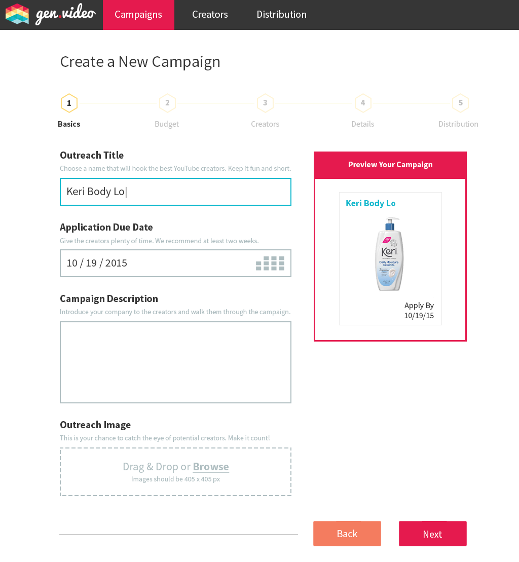
Step 1. Incorporated "Back" button and updated colors for brighter feel.
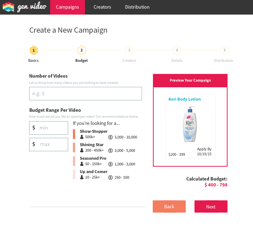
Step 2: In an effort to more strongly pair the budget recommendations with the corresponding field, I rearranged the order and condensed the form. Also, color and button updates.
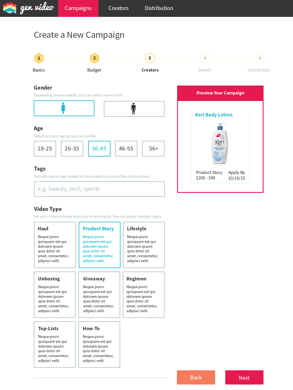
Step 3: Incorporation of brighter, cleaner colors as well as iconography for gender as requested by the client.
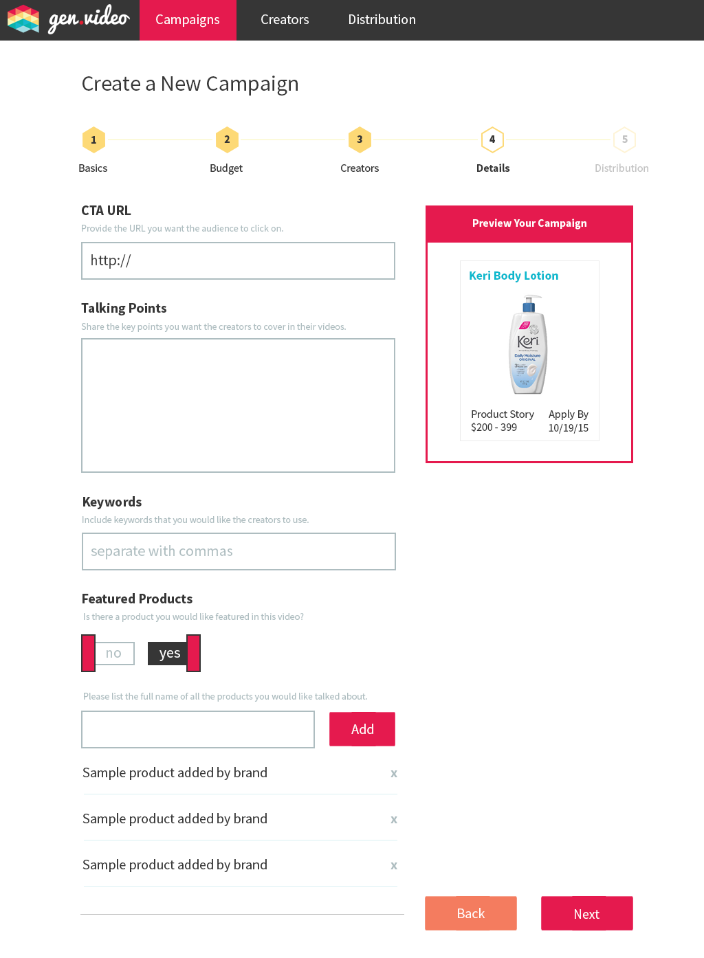
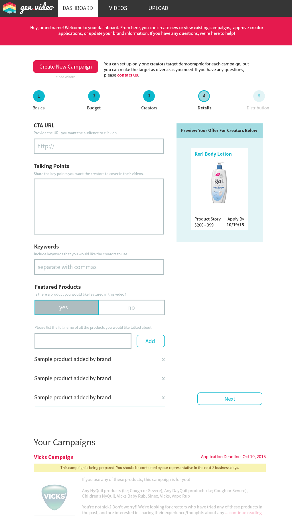
Step 4: Updates to color. Note that the "Featured Products" slider is shown in both states for clarity, but would only be a single element in actuality.

Step 5: Updates to colors as well as a different sorting of distribution options in an effort to communicate value and type. The boxes were also expanded to incorporate logos and more detailed descriptions for ease of use.
Version 3
After submitting Version 2, I once again presented to the internal stakeholders listed above. The final set of design mocks, shown below, incorporate the final tweaks and feedback provided, almost entirely focused on visual elements.
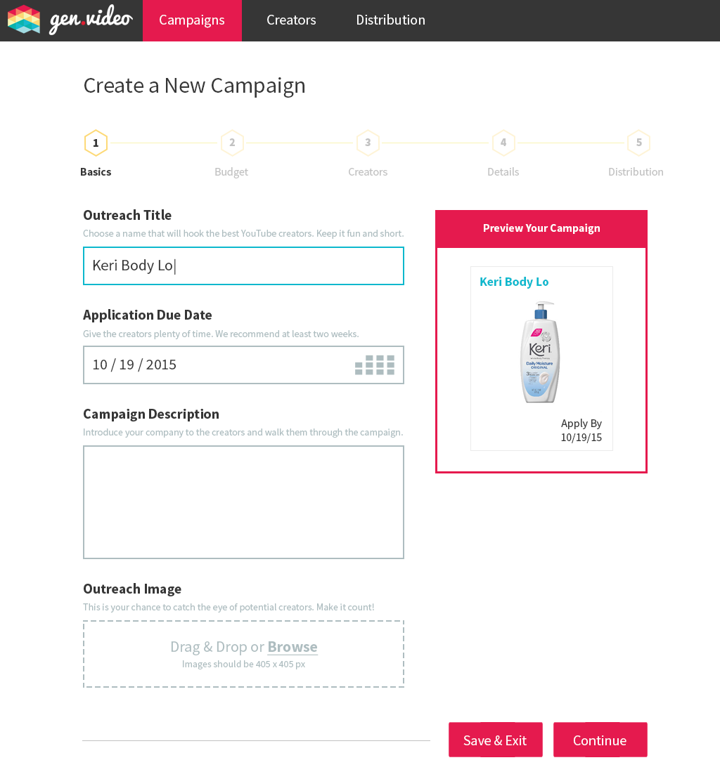
Step 1: Minor changes in color and copy (e.g. the addition of a "Save and Exit" button).

Step 2: Another layout update (moving the budget up to the top again). To avoid the send of three steps as mentioned in the wireframes, the subtext wraps over the recommendations section. Also, the introduction of the "Save & Exit" button.

Step 3: Inversion of the selection styling along with the introduction of the "Save & Exit" button.

Step 4: No changes besides "Save & Exit" button.
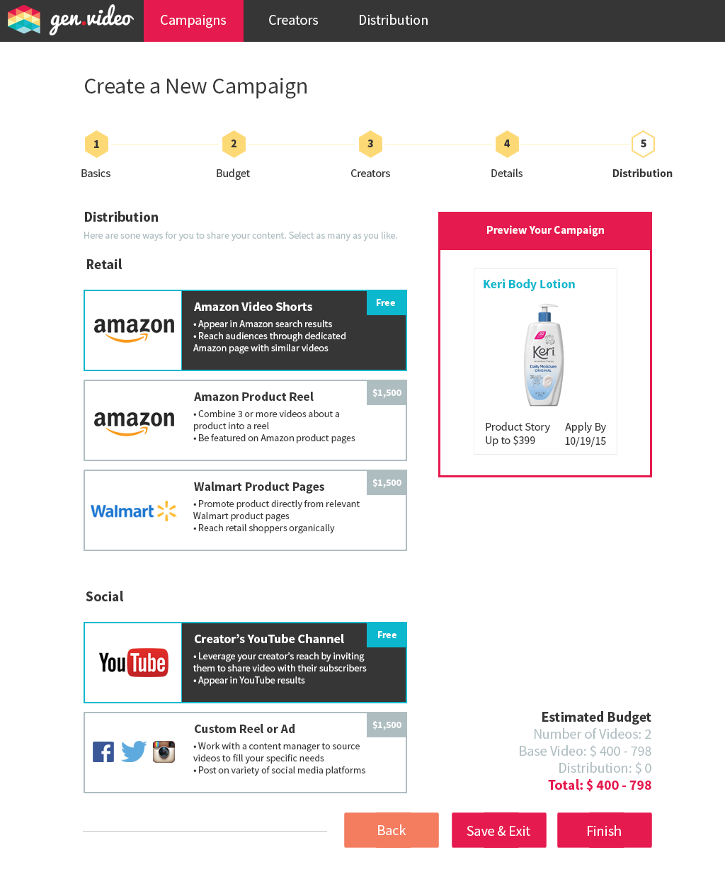
Step 5: Color and button ("Save & Exit") updates.


